Logo Design

The starting point for the design of my personal logo was wanting to combine the circular visual motif of the aperture blades of a camera with a nature/creature-related image that suited me. In case you missed them plastered all over my website, I should mention that I am rather fond of orca whales. So, of course, the first thing that came out of my sketches was a set of whale flukes, which fit as an extension of one of the blades.
Looking through a google search of many different styles of aperture blades, a set that was smoothly curved immediatly caught my eye, and I drew it with the whale flukes and coloured in a gradient of blue. It was a happy accident that the aperture blades also took on the look of a cresting wave, with the whale flukes diving in.
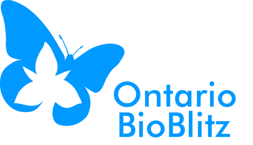
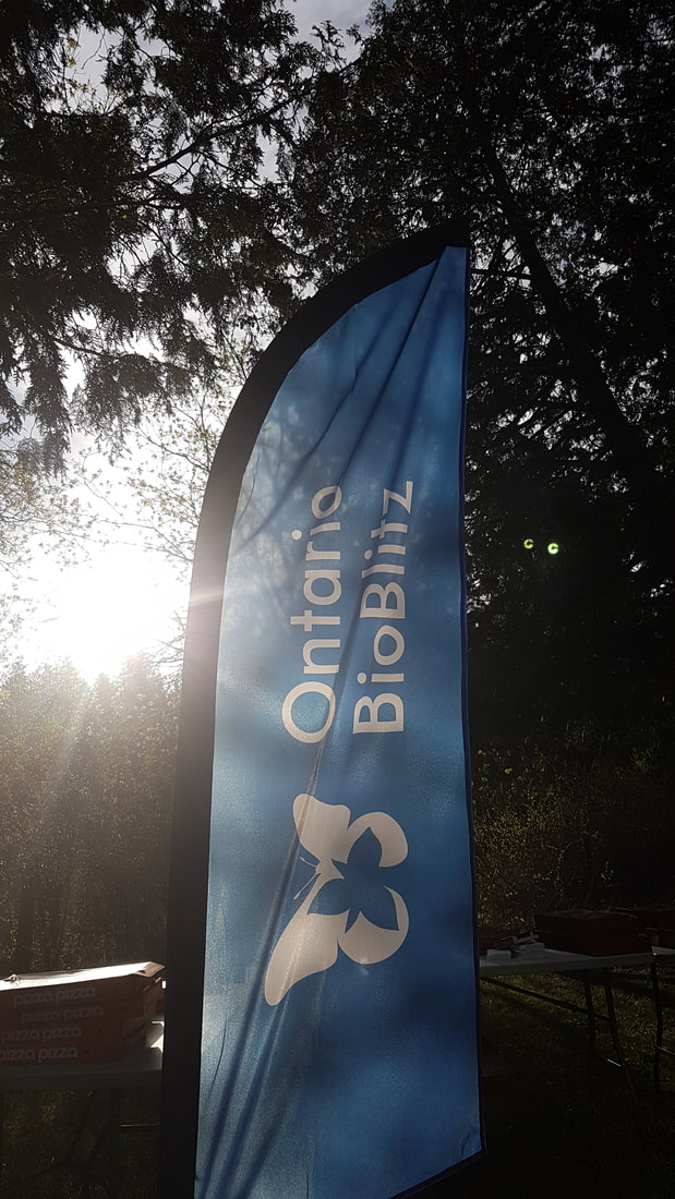
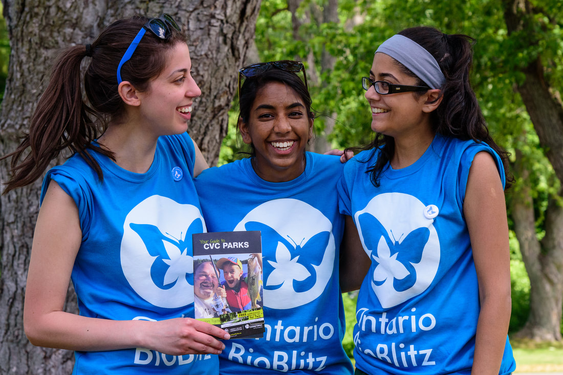
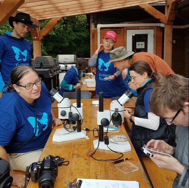
In 2014 I developed this logo for the Ontario BioBlitz program, along with a complete overhaul of the visual brand (which you can see at www.ontariobioblitz.ca). I wanted the visuals to be simple, but still modern and accessible to a broad range of people since citizen science and engaging locals in the environment around them is a big part of the Blitz's mandate. Azure blue made the most sense for the logo design because it matches the distinct t-shirt colour worn by Ontario BioBlitz participants every year, which I also have designed each year since 2014. The butterfly silhouette is based on a monarch butterfly, an iconic Ontario Species At Risk that is appealing even to the non-science crowd (not too creepy crawly or slimy!). The trillium makes the direct connection to Ontario, as it is the provincial flower.

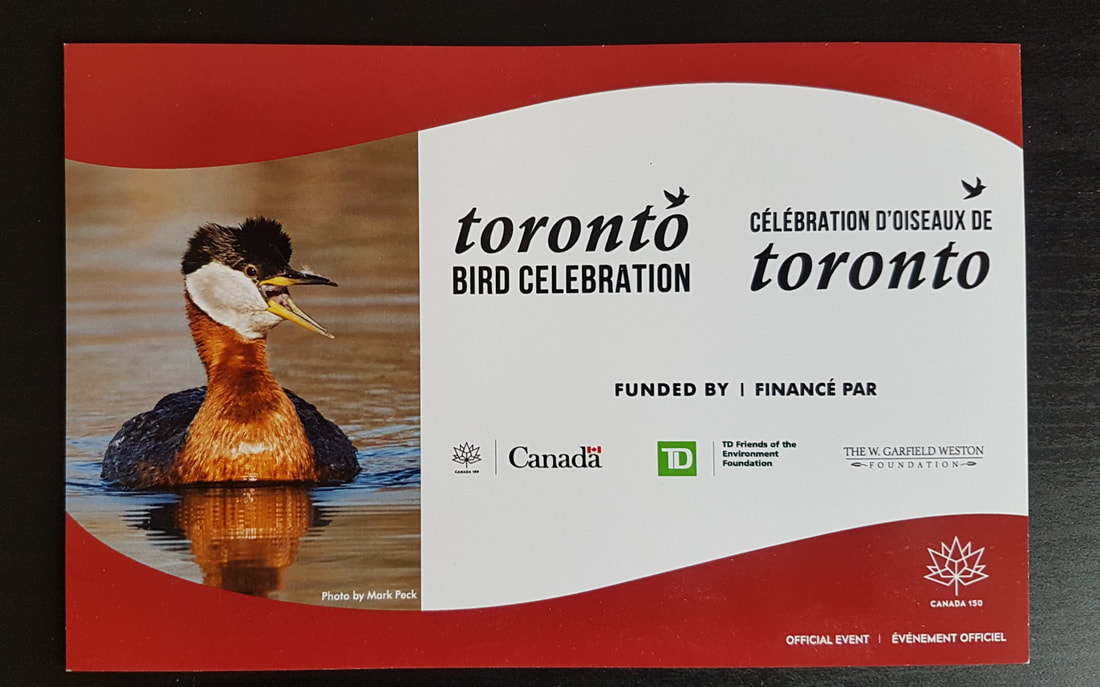
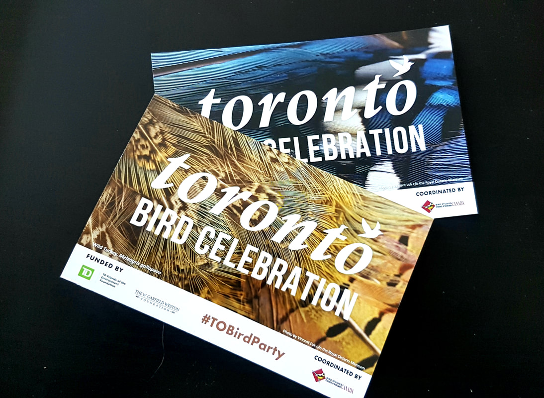
2017 Marked the first year of the Toronto Bird Celebration. This two-week long series of events, festivals and activities are coordinated and planned by Bird Studies Canada and a partnership of dozens of non-profit organizations across the Greater Toronto Area.
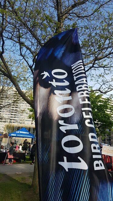
I was contacted by the Bird Studies Canada Toronto programming coordinator to assist with some design work for the celebration in 2017, including the wordmark that would be used for the whole thing. BSC wanted a similar logo to another event that they participate in, called Vancouver Bird Week. I provided some options to choose from, a few with local Toronto landmarks, but the winning design was this clean and simple version that has bird illustrations incorporated into the typography. The wordmark appears on all materials associated with the Toronto Bird Celebration - It's really cool to see a design you made on a flag!
I was contacted by the Bird Studies Canada Toronto programming coordinator to assist with some design work for the celebration in 2017, including the wordmark that would be used for the whole thing. BSC wanted a similar logo to another event that they participate in, called Vancouver Bird Week. I provided some options to choose from, a few with local Toronto landmarks, but the winning design was this clean and simple version that has bird illustrations incorporated into the typography. The wordmark appears on all materials associated with the Toronto Bird Celebration - It's really cool to see a design you made on a flag!
|
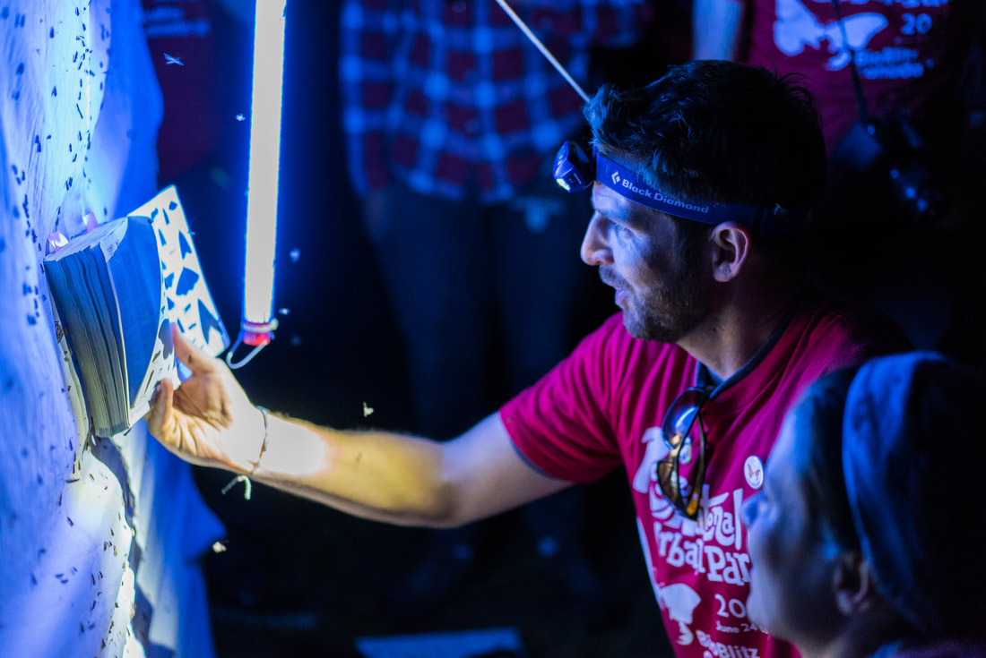
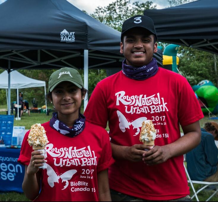
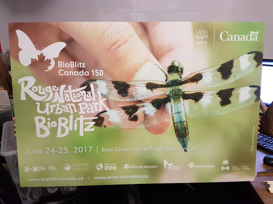
In 2017, for BioBlitz Canada 150, I wanted to design a special t-shirt graphic to commemorate the Rouge National Urban Park flagship event that I was coordinating with Parks Canada and the Royal Ontario Museum. I hand-drew the artwork and scanned it to finalize a digital version that was then used for promotional materials like posters, buttons and social media banners, and the free participant t-shirt that I also designed.
|
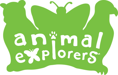
While working on the Animal Explorer Program at the ROM in Summer 2012, I spent a lot of time with the cuddly explorers. When my supervisor asked me to come up with a potential logo for the program, I knew right away that I wanted to incorporate a sillhouette of some of the cuddly explorers within it.
I chose one of each group of organism represented at the time - a mammal, an insect, and a bird, and sketched rough outlines of their forms. I then blended them together inso a single silhouette, and began working out the word shapes.
The lettering itself is also my own hand-drawn font, with creature accents to add even more of a playful, child-oriented logo, without making the letters difficult to read or unrecognizable.

